
Why use an offbeat typeface?
When you have design constraints that limit the amount of dominance and visual expressiveness you can create (for example, if you you had a predefined color palette or were limited to pool of boring stock photos), changing a single typeface can add a lot of variety and completely change the feel of the design.
Choosing a quirky, decorative typeface can add a lot of personality to an otherwise stale design, and it’s a relatively quick revision to make.
You might hesitate at the idea of using an unexpected typeface, but you need to realize that whether a font looks good or not is all about context. A bizarre display typeface might be the wrong choice in many situations, but when you’re looking for a simple way to make your design more exciting or provide some unique personality, this pattern can be a simple and perfect solution. And, you’d be surprised how nice an uncommon, unique display typeface can look in the right setting.
Examples of quirky typefaces in action
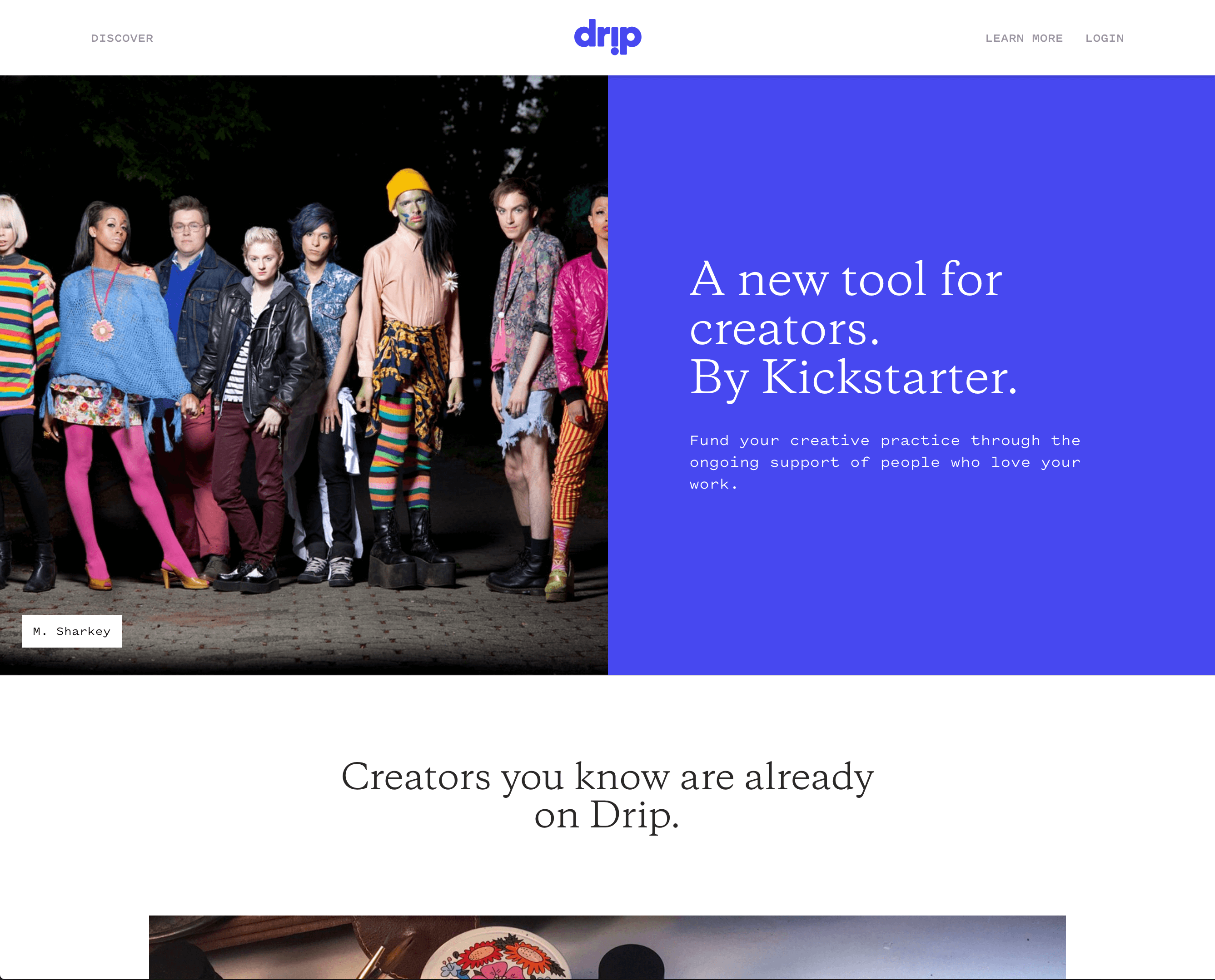

Via Drip
At first glance this page looks like it’s for stuffy enterprise software. Then you see the headline typeface, Galaxie Copernicus. This typeface signals that, no, this is not just another generic corporate website or cookie cutter startup site. The odd typeface is a strong signal that this brand is more than the logo seems to imply. (The quirky photos also reinforce this.)


Via Daniel Sammut
This designer chose a very simple design for his portfolio, and most of the design’s character comes from the typeface, Saol Text. If you switch the typeface so something more common like Times New Roman, the design loses its character:

This is a mockup of the site using a different font.
Clearly, the odd typeface defines the tone for the design. It’s sophisticated but a bit quirky. This shows how powerful typography is.

Via The Outline
While The Outline’s homepage is a bizarre exploration of antidesign and brutalism, when you reach an article page the design tends to become much simpler. To reinforce the feeling of unexpectedness, the design uses an unexpected decorative headline typeface (Eksell Display) and images to accompany essentially a very sparse article design.


The in-body header elements use a quirky sans serif typeface, Maria, which at first almost looks like Helvetica until you notice odd characters like the R and G.
The combined effect of the unique typefaces makes a simple article page layout surprisingly expressive.
Starter sources of offbeat typefaces to try
Decorative display typefaces are ubiquitous and freely available and there are many ways to find good options, but here are some places to look if you’re not sure where to begin.
Use an typeface released by Emigre. This foundry produces tons of offbeat, niche decorative typefaces. Many Emigre typefaces are on Typekit.
Browse display & handwriting fonts on Google Fonts or decorative fonts on Typekit. There are lots of offbeat choices, and you can easily find one that fits the mood you’re trying to create.
Don’t be afraid to pick a font you’ve never seen anyone else use! That’s the whole idea.
When not to use an offbeat typeface
Obviously, never use a decorative typeface for large sections of text or at small sizes.
Also, when you’re choosing a typeface, make sure to first consider the overall feeling and personality you want to evoke. This will help you wade through the nearly limitless options more quickly. Read the content for the design and review the brand values. Try to write down some adjectives to describe the mood you want to create. Then, pick a typeface that reflects those values—and, if you need to create a very conservative, mature, or corporate style of design, you need to realize that this pattern might not be the right choice.