

Via Reverb

Via Amazon

Via Stripe
Accordion navs, nested dropdown menus, and similar kinds of navigation are lazy design; they force the user to do a lot of reading, clicking, and hunting to find what they need. They require the user to read and understand the entire information hierarchy rather than simply offering a starting point. Worse, interacting with these kinds of controls is frustrating: nested dropdown menus often closed unexpectedly, forcing users to re-navigate the maze of menus, and accordion navs often have links that move because of expanding and collapsing, which can cause users to lose track of what they clicked.
Instead of using these complex navigation interfaces, here are a few simple patterns for handling deep content structures.
Categorized Jumbo Dropdown

Via Bombas

Via Ally
Rather than nesting links deeply within multiple dropdown menus, a more usable design pattern is a standard top-level horizontal or vertical navbar, combined with a single large dropdown menu separated into columns by category.
This design requires fewer clicks to reach a bottom-level links, and makes the navigation quickly scannable.
Topic Preview Pages
In some situations, users might not know which bottom-level link they should click. Sometimes, users are looking for ideas and recommendations, not something specific.
To meet this need, great navigation encourages exploration by offering previews of content users might be interested in.
A simple solution is to create parent category pages that show previews of child pages.

Via Nordstrom
Nordstrom’s navigation doesn’t force users to choose a bottom-level category. Instead, a user can view previews of various subcategories on the home page.

Users can also click a top-level link, and see previews of the content found inside its sub-categories. Shown above, after a user clicks the “Men” link, they see an item from each of the Coats & Jackets, Shoes, and Accessories sub-categories. The previews help users decide what they’re interested in, rather than forcing them to make a blind decision immediately.
This seems like an obvious navigation pattern, but you might be surprised to see how many sites force users to choose a bottom-level category immediately. Discoverability is a key part of helping users find the right content—even when they don’t know what they’re looking for.
However, make sure your topic pages actually provide previews of subsections and not just a list of links like on Consumer Reports:

Via Consumer Reports
Breadcrumbs
“Breadcrumbs” refers to a series of inline links indicating the user’s current location in the navigation hierarchy. This design pattern gives users context so they don’t feel lost even when deep inside large, nested content. The breadcrumb links also allow users to backtrack through a deep navigation as far as they need to without having to start over.

Via Basecamp
Basecamp has surprisingly deep navigation, but the use of breadcrumbs helps users track which feature and project they’re currently viewing.
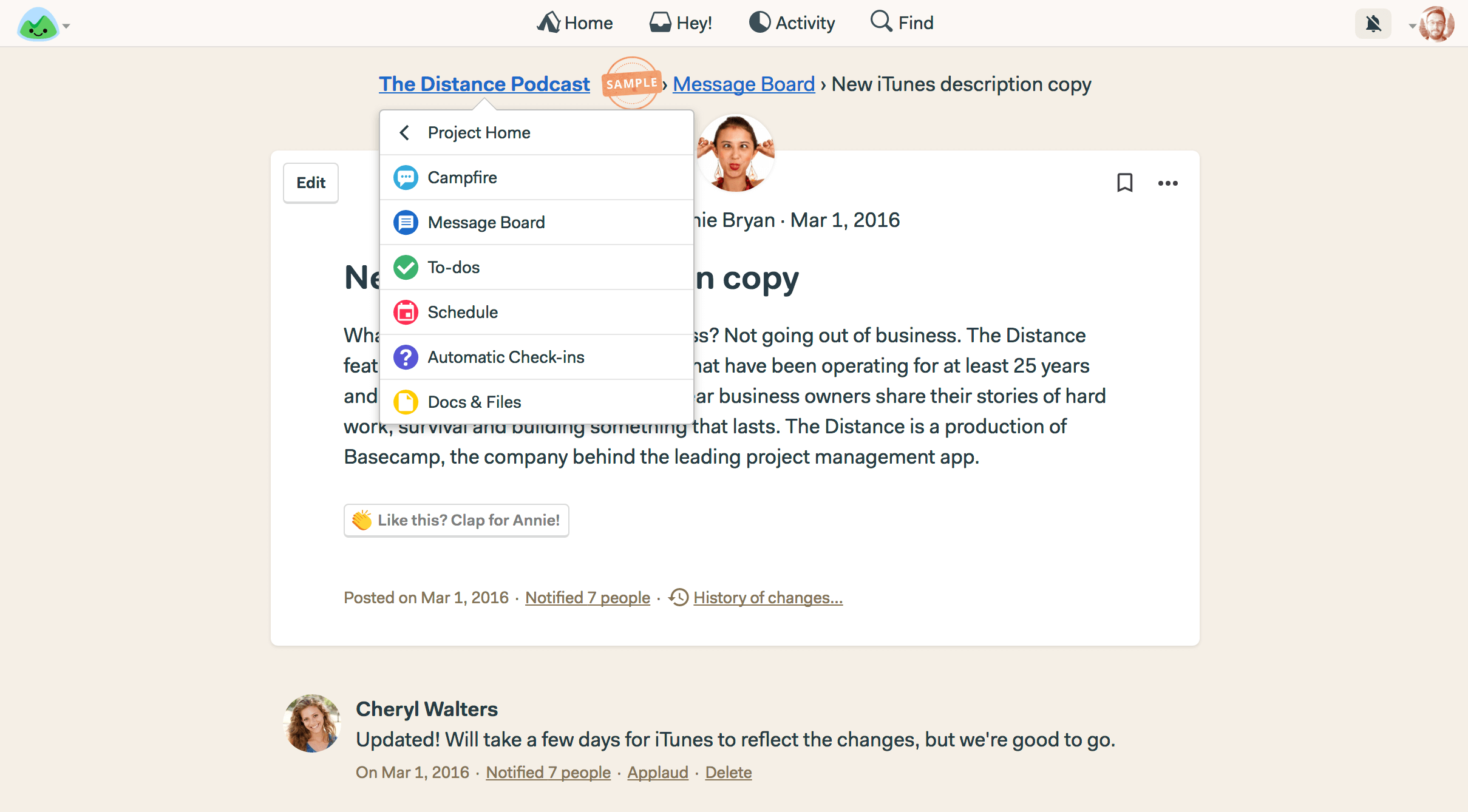
Via Basecamp
The first breadcrumb link doubles as a dropdown so users can quickly jump into a new section without returning to the homepage.
Deep content hierarchy doesn’t necessarily require a complex UI
Your job as a designer is to guide users to the right information just as much as to structure and present it. It’s easy to get lost in structuring and organizing and to let that structure determine our design decisions for us. But, when you design for deep navigation, try to make the work required of the user as minimal as possible. Encourage exploration and offer scan-ability. Or, emphasize search patterns when the user is looking for something very specific.