
Long forms cause all kinds of frustration, the most infamous of which is when a user enters data and accidentally reloads the page, losing their progress.
Long forms also infamously intimidate users—and cause them to leave your webpage without finishing the form—because long forms look like they require a lot of effort to complete (and they do).
While clever designers and writers can simplify forms somewhat by cutting unimportant fields, in many cases long forms are essential and unavoidable.
Braintree’s merchant account signup form is incredibly long and looks like a lot of work, but all the fields are important.
However, there are design patterns you can use to make long forms less intimidating and easier to complete.
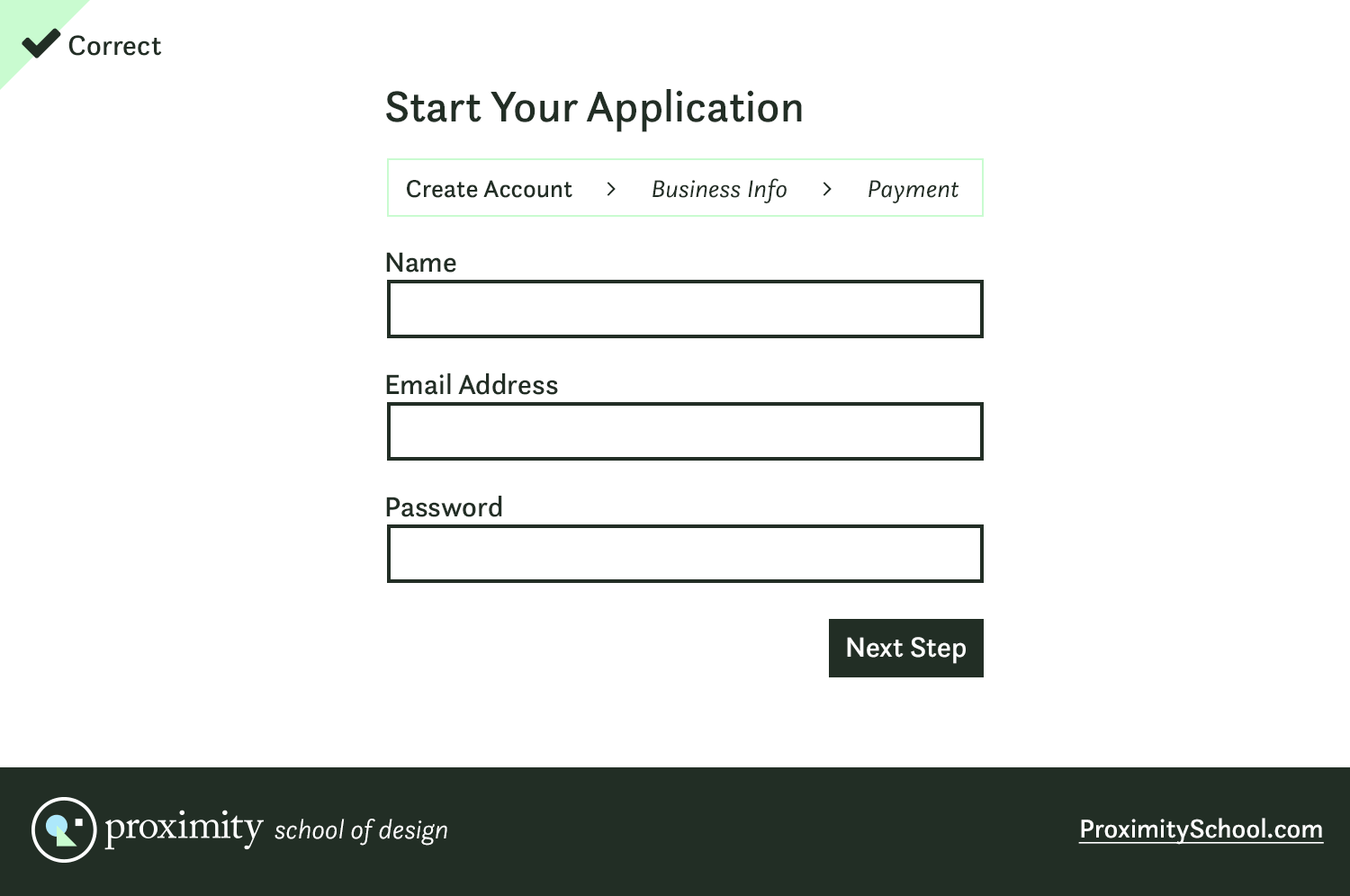
Wizards (or multi-step forms)
When you’re designing a long form and are unable to remove fields, try breaking the form into small sections on several sequential pages with a progress indicator. This is often called a “wizard” or multi-step form.

Via Geico

Via Mailchimp
With this design, the user isn’t intimidated upon first glance. The progress indicator makes it clear that there will be more work to do, but progress feels more immediate, so the user is more likely to proceed.
Further, when implemented properly, multi-step forms can help users save their progress, so that if they accidentally refresh the page, lose their internet connection, etc, they can come back later and continue where they left off.
Reduce the perceived length of the form with horizontal labels
For forms with more than 2-3 rows of fields, aligning labels horizontally can reduce the perceived length of the form and increase the rate users complete and submit the form.

The form looks longer (and thus more intimidating) than it really is because the label positioning makes the form taller.

To use horizontal labels, ensure that all form fields are the same width. Then, right-align the labels so that they are as close their associated input fields as possible.
However, a common problem with horizontal labels is caused by long text labels. Long labels can cause various issues, but most commonly in responsive designs, the long labels occupy too much of the horizontal space so that the form field itself becomes too narrow.


To fix this, just wrap the label text to multiple lines.
Hide labels and use placeholder text
Obviously labels are a big factor in why some forms become so long. By hiding labels, you can make your form substantially shorter.

Even a simple form looks much less intimidating without the labels cluttering up the design.
The Google Calendar redesign removes visual clutter as much as possible. The labels were all removed and replaced with placeholder text. Duplicate and unclear buttons were removed. The result is much simpler and less overwhelming at first glance.

Before the Google Calendar redesign. Via Google Calendar

After the Google Calendar redesign.
However, there is a caveat to hiding form labels: labels are essential for accessibility. So, when building your form design, make sure that labels still exist within webpage markup and are hidden using the correct techniques so that screen readers and assistive devices can find still find the labels. For example, use the bootstrap framework’s .sr-only class (see the code here).