
Depth can accomplish a lot within your design, and there are tasteful ways to create depth while ensuring your design is modern and relevant.
Why use depth & lighting effects
Depth can create dominance by visually emphasizing important elements. If only one element has a lighting effect, users are more likely to notice it first.
Via Medium
The clap icon on Medium is the only element with a depth effect, which makes it more visually dominant.
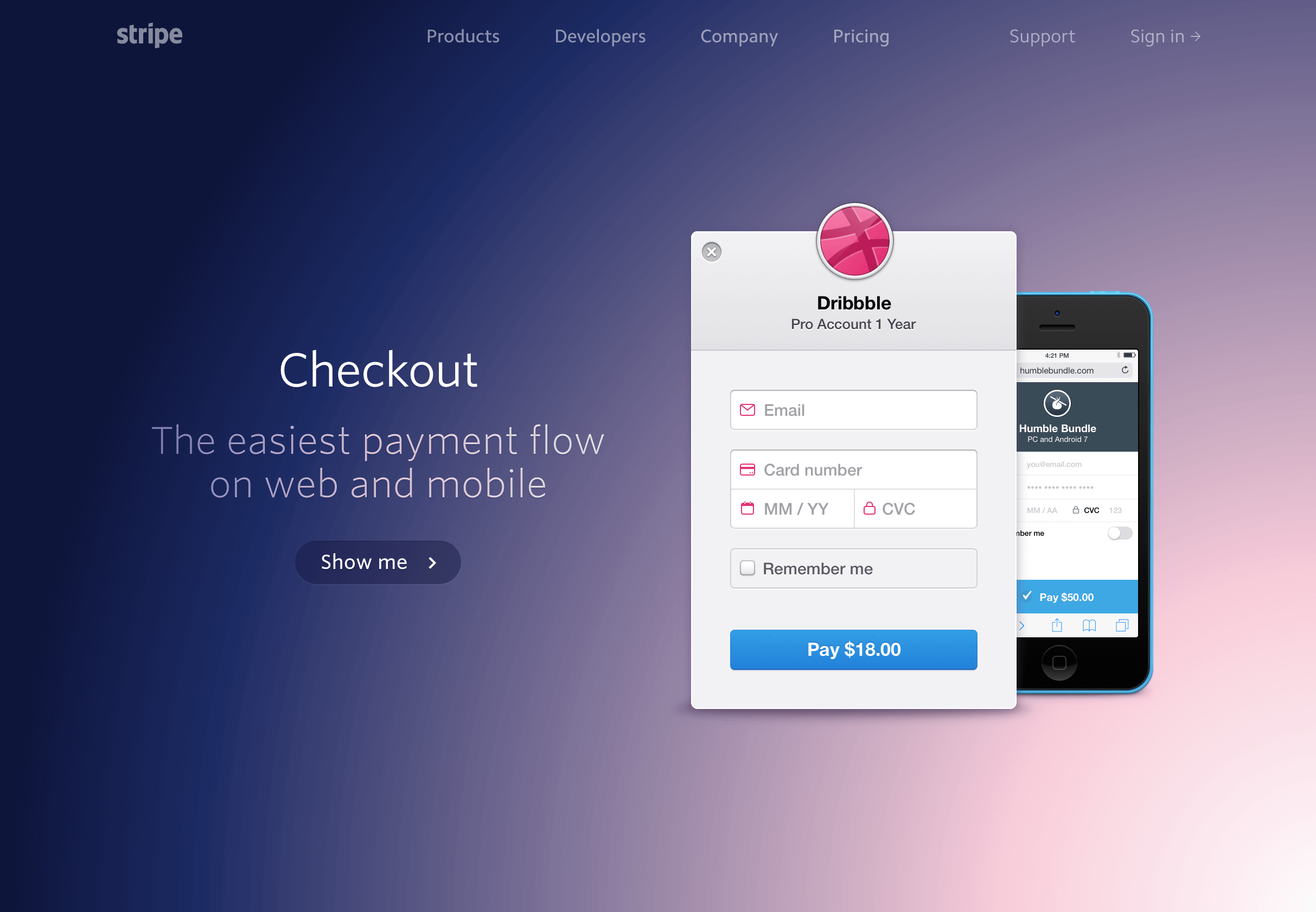
Via Stripe
The background gradient on Stripe’s feature page leads your eye towards the graphic.
Depth can make interfaces easier to understand because they mirror the real world. Even if you prefer a “flat” design style and want to avoid hyper-realistic skeuomorphism, some subtle uses of depth can communicate a lot to users.

Via Trello
Trello famously uses a card-based interface with subtle shadows and depth effects to reinforce the kanban card metaphor.
Depth effects are one kind of affordance (a signal of interactivity). Gradients and shadows signal interaction states by mirroring the way we manipulate objects in the real world. Again, this is still possible without wading neck-deep into skeuomorphism if you don’t want to. For example, buttons with shadows look clickable:

Via Google
Examples of Shadows & Glows

Via Google
The famous Google search box has a subtle shadow to draw attention and encourage users to interact with it.

Via Optimizely
Optimizely uses very soft shadows to draw attention to featured content.

Via Intercom
Intercom’s feature page uses shadows to separate foreground elements from the decorative and colorful background.
Examples of Gradients
Gradients are a lighting effect where one color fades into another. Please don’t call it a “color transition”.

Via Spotify.me

Via Carrd
Avoiding banding
“Banding” happens when a gradient is too gradual or covers a large area and there aren’t enough values between the endpoint colors to make the fade appear smooth, so the gradient appears to be made of stripes.
Banding is becoming more rare as high pixel density screens become more common, but it’s still an issue to watch out for with extremely subtle gradients. (And remember, not everyone is looking at your design on a 5k retina iMac screen.)
While stepped or banded gradients can be an intentional design element, usually banding is an error and looks unprofessional and distracting.
A few methods for avoiding banding:
- Add a noise pattern on top of the gradient, then reduce the opacity of the noise to 20-30%. The noise will help hide the banding. (For example in Phototoshop: Filter > Noise > Add Noise)
- Adjust the endpoints of the gradient to more dramatic values, so there are more colors to use in between them. Even if the endpoints aren’t the precise colors in your color scheme, the gradient should match if you just use slightly darker and lighter values.
- Apply the gradient over a smaller area. You can do this by cropping the element with the gradient applied, or even applying the gradient so that one of the endpoints is at half the available range.
Examples of Perspective
Of course, there are other depth effects beyond shadows and gradients. Another common design pattern is showing depth through perspective.


Via The Wirecutter
The Wirecutter uses depth effects such a dog-eared corners of pages and banners that wrap behind other elements to add emphasis to important elements.